This is sample text.
Understanding the CSS Box Model helps to explain much about how to use CSS to arrange objects. Even more important, however, is understanding how the box model is implemented by the different browsers. Most notably, Internet Explorer for Windows often requires workarounds, as shown in the Floating Boxes and List as Links snippets. Browsers based on the Gecko engine (Mozilla and Netscape 6 and above) or KHTML (Safari and Konqueror) seem to correctly implement the box model, while Internet Explorer 5 for Mac is usually good, but not quite as correct as Gecko or KTHML browsers (such as with the Floating Boxes snippet).
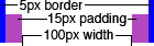
The example on the right shows the different parts of the CSS Box Model:
Margins, borders, and padding sizes can be declared to be a certain amount of measured units, such as points (px), inches (in), or centimeters (cm). They can also be declared to be relative to the current font size (em or ex). You can also declare them to be a percentage of the width of the containing box.
In the CSS Box Model, the positioning and size should only represent the content (white in the example). The padding, borders, and margin are not used when computing the location of a box or its size.
If you wish to have a box which is the full width of the window, be careful how you define the margin, border, and padding. To show what happens, we declare a box with this CSS:
div.demo2 {
    width: 100%;
    border: 2px blue solid;
    padding: 10px;
}
Our intent is to have a full-width box with borders and padding around the content. The result is:
Using Internet Explorer on Windows prior to IE6 the page looks reasonable, but viewing this page with Gecko or KHTML browsers, as well as IE6/Win, causes the horizontal scroll bar to appear, no matter how wide you make the window. This is because the padding and border adds 24 pixels of width to the box which is already defined to be 100% the width of the body. Since the body of the document has some padding, the border of the box doesn't start exactly at the left edge of the window. There's a bit of extra room, but not 24 pixels' worth.
While IE/Windows seems to be doing what we want, it's actually the Gecko, KHTML, and IE6/Win browsers which are adhering to the specifications.
There are some ways to work around this, while at the same time making the content appear the same on the various browsers:
Problems can also arise while trying to use percentage widths other than 100%. If you want side-by-side blocks, be careful with their widths - two blocks each with 50% width may take up more than the full width of the window if you've also defined borders or padding on the sides. One workaround is to float the left block, set its width to 50%, and the right block will have its width and position automatically set. Be warned, however, that you may run into some of the problems described in the Floating Blocks snippet.
Another option is to use one of the techniques above - don't define the width of the blocks, but wrap them with outer blocks which define the width. This also works around problems you may see if you use percentage widths but pixel- or font-based padding and borders, since you can't tell in advance what percentage of the body width your padding or borders will use.
As mentioned above, there are times when IE/Windows displays boxes differently than Gecko and KHTML browsers. This is because instead of only computing position and width based on the content area, IE/Windows also adds the border and padding into these computations. In addition, IE/Windows sometimes does not correctly collapse margins for nested objects.
IE6/Windows and IE5/Mac will follow the standards if you have a compliant doctype at the start of your document. If you do not, those two browsers will act as older IE/Windows versions do and incorrectly interpret the width of a block. All of these examples assume a proper doctype (XHTML/1.0 Strict in these particular pages).
If you are using XHTML, you'll want to not use an <?xml?> prolog in your document, since that causes IE6/Win to revert to the incorrect box model.
One way around box model differences between IE/Windows and other browsers is to use CSS hacks to define two different widths if possible. Be warned that these do make your CSS file longer and more complex, but sometimes they are fine for shorter CSS files. Also, you need to be careful with the widths, since it can involve adding different units of measure (such as pixels, ems, and/or percentages).
If your box width, padding, and borders are all represented in similar units (such as pixels) then the CSS Box Model Hack can work for you. IE6/Windows and IE5/Mac are not targets for this hack, so be sure you declare a doctype to get the correct box model behavior.
To demonstrate the CSS Box Model hack, the CSS on the left will generate the box on the right (with the addition of the measurement image; the demo box is live HTML and CSS):
div.demo3 {
    width: 140px;
    border: 5px blue solid;
    padding: 15px;
    voice-family: "\"}\"";
    voice-family: inherit;
    width: 100px;
}
html>body div.demo3 {
    width: 100px;
}
The way this works is that all browsers initially get the width set to 140px. IE/Windows versions prior to IE6 do not correctly handle escaped quotes in a string, so it sees voice-family set to the empty stringfollowed by } to end the rule. It will then keep reading the CSS file until it sees something it understands, which is after the second }. Other browsers, however, see that voice-family is set to "}" (including the quotes) then immediately reset to inherit the value from its parent. The width is then reset to 100px.
The next rule is to make Opera 5 also work. It correctly implements the CSS box model, but it does not correctly handle escaped quotes in strings. Opera 5 however does know about CSS2 selectors, so it reads the new width setting. IE/Windows doesn't handle CSS2 selectors, so it will ignore that rule. In addition, some browsers which do not correctly handle the strings with escaped quotes also skip the following rule (since they have problems getting back into sync), so this extra rule also helps them.
Probably the easiest method to ensure uniform sizes is to nest boxes, as mentioned above with boxes which are intended to be full width. Note that by setting the width of the outer box, you're forced to add all of the sizes (border, padding, content width) using the same units. Since our CSS hack example uses all pixels, it's easy to convert to a nested box:
div.demo4 {
    width: 140px;
}
div.demo4 div {
    border: 5px blue solid;
    padding: 15px;
}


<div class="demo4">
    <div>
        This is sample text
    </div>
</div>
This does require that you add an extra container in your HTML source to support the presentation, but there are many times when you have another container anyway. If there isn't a preexisting container, then you need to decide which method will be easier to support.