 For Internet Explorer 5 on the Mac the grey background is only on the right side of the page, but the text still floats under the left box. All text floating under the left box has a white background (image at the right).
If you are trying to float <div></div> boxes and are wondering why they won't work correctly, this page explains some reasons and workarounds. You can also apply these techniques to other objects, such as images.
Unless otherwise specified, all the examples are actual HTML with CSS applied rather than images. You can try this page on different browsers to see how it renders.
Our example starts with this CSS:
div.left1 {
    color: #006;
    float: left;
    width: 50%;
}
div.right1 {
    color: #600;
}
and this HTML:
<div class="left1">
    This is the box on the left.
</div>
<div class="right1">
    This is the box on the right.  It contains
    enough text to make sure that there will be
    at least one line wrap.
</div>
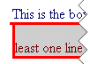
The result is:
which looks fine - the red text wrapped under the blue text on the left.
When we add a background color to the right box, we get:
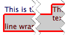
Which may not be what you expected. For most browsers, the grey background extends beneath the text on the left. This happens because the right box is just that - a box with four straight sides. If you want the left box to have a white background, you need to explicitly set its background color.
For Internet Explorer 5 on the Mac the grey background is only on the right side of the page, but the text still floats under the left box. All text floating under the left box has a white background (image at the right).
If your goal is to have the grey box only on the right side with all the text enclosed in that box, you can set the left margin on the right box to make sure it will clear the left box:
div.left3 {
    color: #006;
    float: left;
    width: 50%;
}
div.right3 {
    color: #600;
    background-color: #ccc;
    margin-left: 50%;
}
and the result is:
One effect you could add is to have the grey of the right box be the full width of the window, with a border around it. As with the background above, the border will be box-shaped, surrounding the left text. If you want the left box to still have a white background, and the border wrap around the outside of the left text, you can use some creative border definitions:
div.left4 {
    float: left;
    width: 50%;
    color: #006;
    background: #fff;
    border-width: 0 3px 3px 0;
    border-style: solid;
    border-color: #f00;
    padding: 3px 0 0 3px;
}
div.right4 {
    color: #600;
    background-color: #ccc;
    border: 3px #f00 solid;
}
and the result is:
Note we set the background of the left box to white as mentioned above. We also set the border-width to different values for the different sides to create the desired effect, as well as add padding to the top and left to compensate for the missing border on those sides (so the contents align with the right box).
 Another approach would be to remove the padding on the left block and include white borders on the top and left (to match the background). You'll end up with corners which are mitered at a 45° angle instead of the square corners in the example. The image at the right demonstrates how this would look.
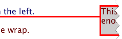 As we saw above, Internet Explorer 5 for the Mac doesn't correctly extend the background color from the right box around the floated left box. The image at the right shows what happens when we add borders; the border for the left box is correct, but the border for the right box is only drawn around the background. It ends up that IE5/Mac can't give us the desired effect with two separate boxes, so the fix is to nest the boxes:
<div class="right5">
    <div class="left5">
	This is the box on the left.
    </div>
    This is the box on the right.  It contains
    enough text to make sure that there will be
    at least one line wrap.
</div>
and manually change the margin on the left (now inner) box to cover up the border of the right (outer) box:
div.left5 {
    float: left;
    width: 50%;
    color: #006;
    background: #fff;
    margin: -3px 0 0 -3px;
    border-width: 0 3px 3px 0;
    border-style: solid;
    border-color: #f00;
    padding: 3px 0 0 3px;
}
div.right5 {
    color: #600;
    background-color: #ccc;
    border: 3px #f00 solid;
}
The result is:
While we believe this will fix the boxes, there's still one problem - Internet Explorer for Windows shifts the inner box too far to the left (as can be seen in the image on the right). Even though this seems to not be the correct behavior, a bit of the border sticks out to the left. A first guess at a fix would probably be to change the left margin on the left box, but it ends up you won't be able to get the exact position - 1 pixel shows a fine vertical line on the left of the inner box, and 2 pixels shows a small stub sticking out to the left. The solution is to add padding to the outer (right) box. This has the problem that the other browsers will (correctly) show the red border on the left, so what's needed is a way to add padding to the left of the outer box only for IE/Windows. The corrected style sheet is:
div.left6 {
    float: left;
    width: 50%;
    color: #006;
    background: #fff;
    margin: -3px 0 0 -3px;
    border-width: 0 3px 3px 0;
    border-style: solid;
    border-color: #f00;
    padding: 3px 0 0 3px;
}
div.right6 {
    color: #600;
    background-color: #ccc;
    border: 3px #f00 solid;
    padding-left: 2px;
}
html>body div.right6 {
    padding-left: 0;
}
The final appearance is:
The padding-left: 2px is applied to all browsers, and the padding-left: 0 is applied to all browsers other than Internet Explorer on Windows. This is because IE/Windows doesn't understand the immediate child selector, so it does not apply the rule with html>body as the first part of the selector.
It doesn't seem intuitive that you would need 2 pixels of left padding instead of 3. For this type of presentation to work on IE/Windows, you will probably end up doing a bit of experimenting before you can get the results to look right.
The borders now look good on the boxes, but the text is cramped next to the left and top borders. We can add padding, but must be careful how we do so. We will add the same amount of padding to all sides of each box, while being careful to take the IE/Windows padding into account:
div.left7 {
    float: left;
    width: 50%;
    color: #006;
    background: #fff;
    margin: -8px 5px 0 -5px;
    border-width: 0 3px 3px 0;
    border-style: solid;
    border-color: #f00;
    padding: 8px 5px 5px 8px;
}
html>body div.left7 {
    margin-left: -8px;
}
div.right7 {
    color: #600;
    background-color: #ccc;
    border: 3px #f00 solid;
    padding: 5px 5px 5px 6px;
}
html>body div.right7 {
    padding-left: 5px;
}
The boxes now have 5 pixels of padding:
Let's first look at the changes for browsers other than IE/Windows. For the right box, we simply add 5 pixels of padding all around. The left box is a little tricker, however. We do add 5 pixels to the padding for each side of the left box, as well as subtracting 5 pixels to its top and left margins (to account for the extra 5 pixels of padding in the right box, which is the container for the left box). The other thing we need to do is add 5 pixels of margin to the right of the left box, to make sure the text of the right box clears border of the left box by 5 pixels. Overall, we can see that these changes follow logically from the example where we originally added the borders.
Internet Explorer for Windows needs some other changes. In our last border example, we needed to set the left padding of the right (outer) box to 2 pixels. When we add padding to the other sides to make space for the text, the left padding increases to 6 pixels. For the left box, instead of setting the left margin to -8 pixels as with other browsers, we need to set it to -5 pixels. As with the previous example, these values were reached by experimenting with different numbers. The amount of padding on the left side of the grey box is indeed one pixel wider for IE/Windows, but setting it to 5 pixels would either cause a thin vertical red line on the left or a bit of the left box bottom border poking out on the left (depending on the left margin value for the inner box).
The examples above work, but note they all use widths relative to the page width and allow plenty of space for the non-float box (grey box in the examples above). If your page is designed so it's possible for the non-float box to become too narrow for its content, you will see that IE/Windows drops text down below the float so it can flow underneat the float. This even happens when the margins are set such that there is no more horizontal space under the float than next to it. If we use this CSS (setting the background color of the float to better show the space it takes):
div.left8 {
	float: left;
	width: 500px;
	background-color: #3cc;
	margin-bottom: 0.5em;
}
div.right8 {
	margin-left: 510px;
}
with this HTML:
<div class="left8">This is the box on the left.<br/>
    It contains several lines of text<br/>
    so that we can see the behavior<br/>
    of the long words in the box on<br/>
    the right.</div>
<div class="right8">OneLongWord, AnotherLongWord, AnExtremelyLongWord.</div>
the browser you are currently using will display it as:
These four screenshots (reduced in size) show how IE/Windows displays the HTML as the window is made narrower:

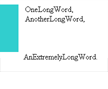
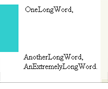
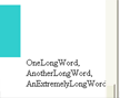
As you can see, each word which can't fit horizontally on the page gets brought below the float, even though there is no more space available. If the left margin were not set for the long words, they would wrap around to the left.
This behavior also happens if you set the left padding instead of the left margin.
If your widest element is at the top of the non-float box, you'll see an all-or-nothing effect when the window becomes narrower.
While this example shows long words, the same behavior happens with images, form elements, etc.
If it is possible for you to use absolute positioning, that will eliminate the dropping float behavior. However, in many designs that would make a large change in the appearance if the non-float item is what sets the length of a section. Since absolute positioning takes a box out of the flow of the document, you do not know where the bottom of it is (unless it's an image or something else with a predetermined size).
If your don't set a left margin on the non-float box and want to have text wrap underneath the float, then it may be OK to leave things as they are. However, if you don't want blank lines to appear (as with the middle of the four images above) then you can add a float to the non-float box. If the window becomes narrower, the whole box will move underneath the first floated box.
If your design allows it, you can consider switching which boxes are floated so the floated box (with the cyan background) becomes non-floated, and the non-floated box (with the long words) is floated to the right. You will still see gaps if you have text as above, but the behavior of the page may be better with a narrow window.
What you should do to decide how to handle the float drop situation is to try the different workarounds and see what behavior is least disruptive.